Why Every Aesop Looks Different, and Somehow Exactly the Same
Most global brands grow by repeating themselves. Aesop became unmistakable by refusing to.
Walk into Aesop in Marylebone and you enter something resembling a quiet, beautifully considered library: warm timber, muted green, small rooms and an atmosphere that seems designed to make you lower your voice.
Cross London to Battersea Power Station and the mood changes completely. Here, Aesop borrows from the building’s industrial past. Perforated metal, a control-desk-like basin and an enormous spherical light evoke the retro-futurism of an old science-fiction film.
At Coal Drops Yard, it changes again. Yellow steel sits inside a nineteenth-century brick structure once used to sort coal. In Kyoto, black mesh, shadows and bottles arranged almost like Japanese calligraphy define the space. In Seoul, another store takes inspiration from the jeongja, the traditional open-sided Korean pavilion. They do not look alike. And yet, somehow, they all look like Aesop.
That contradiction contains one of the smartest ideas in modern retail. Aesop understood that consistency does not require sameness.
The problem with becoming recognisable
Most companies are taught that scale depends on replication. Once you discover what a successful store looks like, you copy it. The same flooring. The same shelving. The same lighting. The same colour palette. The same counter. Repeat it in London, Paris, Tokyo and New York until a customer can walk into any branch without looking at the sign and immediately know where they are.
There is a very good business reason for doing this. Standardisation is easier. It is faster. It makes procurement simpler. It reduces design decisions. Most importantly, it protects brand recognition. Aesop made almost the opposite decision.
The Australian skincare company, founded in Melbourne in 1987, describes its approach to new stores as beginning not with a global template but with what already exists. Its stated intention is to “weave ourselves into the fabric of place” rather than impose something discordant upon it, using a design vocabulary relevant to each location. In other words: Before asking what an Aesop should look like, Aesop asks where it is.
That sounds almost obvious. It is surprisingly rare.
The anti-chain
The first Aesop store opened in 2003 in St Kilda, Melbourne, in an unlikely space: a narrow ramp descending into an underground car park. Rather than hiding the limitations of the site, the company worked with them. Aesop now points to that tiny store as the precedent for the architectural philosophy that followed. As the company expanded internationally, it could easily have replaced this approach with a retail manual.
Instead, it turned individual architecture into part of the brand. Aesop began working with architects and designers in different cities and gave them unusual freedom to respond to individual buildings, materials and communities. Designers have included firms such as Snøhetta, Torafu Architects, MLKK, Studiolucaguadagnino and many others. The result is a network of stores that can differ dramatically in colour, material and form.
This makes expansion harder. That is precisely what makes it interesting. A normal chain spends enormous effort removing variation. Aesop uses variation as an asset.
Marylebone is allowed to feel like Marylebone
Consider its current Marylebone store. Instead of importing an abstract “Aesop aesthetic”, the design team looked nearby. The British Library influenced the material palette. Neighbourhood bookshops influenced the layout. Warm woods and cool greens were used to divide the store into smaller spaces that encourage exploration. Now travel a few miles south. At Battersea, none of that would make sense.
The store sits inside the former Battersea Power Station, so Aesop worked with Al-Jawad Pike to reference the building’s industrial history. Display systems resemble control equipment. A giant orb hangs overhead. Acoustic panels and metallic surfaces create something closer to a beautifully imagined twentieth-century laboratory. Go north to Coal Drops Yard and the original vaulted brick structure is left visible. A freestanding yellow steel framework is inserted into it rather than attempting to erase the building’s nineteenth-century past.
Then Seoul. Aesop Seochon takes cues from the Korean jeongja, translating the idea of an open pavilion into folding doors, timber, stone and aged copper. Then Kyoto. Its first signature store there draws on In Praise of Shadows, traditional machiya townhouses and the vertical alignment of Japanese writing. Bottles appear against dark mesh almost like characters on a page.
Same company. Different answer. This is what makes Aesop’s model unusual: the location is not simply somewhere to put the brand. The location is allowed to change the brand.
So why doesn’t Aesop disappear?
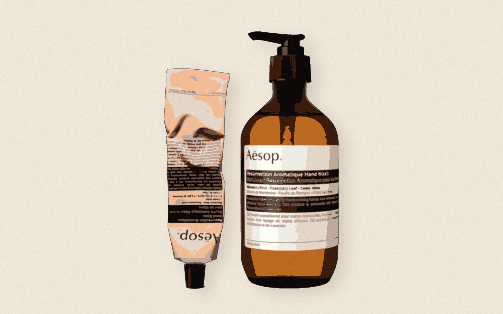
Here is where the strategy becomes much more sophisticated. If every store is different, shouldn’t recognition collapse? It doesn’t, because Aesop has separated two things that most brands treat as the same: brand codes and brand decoration. The decoration changes constantly. The codes barely do. You still encounter the amber bottles. The restrained labels. The orderly rows of products.
Muted lighting. A calm atmosphere. Staff who encourage conversation rather than push a rapid transaction. And, perhaps most importantly: the sink.
The sink is almost more important than the logo
Look through photographs of Aesop stores and one object keeps appearing. Sometimes it is carved from stone. Sometimes concrete. Sometimes stainless steel. Sometimes brass. Sometimes it is enormous and sculptural; elsewhere it almost disappears into the architecture. But there is almost always a basin.
Aesop has explained that demonstration sinks are a consistent part of its stores because customers are supposed to experience the products physically: wash their hands, feel a cleanser, smell a formulation and talk through it with a consultant. That is extremely clever. The object stays. Its expression changes. A traditional retailer might specify one sink and reproduce it 300 times.
Aesop specifies the ritual. The architect can then reinterpret the object around it. And this gets very close to the real reason the strategy works. Aesop does not standardise exactly how its brand looks. It standardises how its brand behaves.
The invisible template
There is, in fact, a template inside Aesop. You just cannot see it as easily as you can at Starbucks.
The stores tend to share qualities rather than finishes: subdued or natural lighting, somewhere to sit, a demonstration basin, considered sound, space for conversation and an overall sense of refuge from the visual aggression of conventional retail. Aesop’s former creative leadership described these elements as deriving from hospitality rather than simply merchandising. So behind hundreds of different interiors sits a surprisingly disciplined system.
Calm. Tactility. Hospitality. Product ritual. Local relevance. Restraint. Once those are protected, the tiles can change. The walls can change. The colours can change. The architect can change. That is why an Aesop can be made of brick in Seoul, pale stone in Kyoto or industrial metal in London without losing its identity. The brand exists one layer deeper than the aesthetic.
And that makes the stores interesting again
There is another advantage. If every store looked identical, there would be little reason to care about a new one. You have already seen it. Aesop’s approach makes each opening capable of becoming a small cultural event.
Architecture publications cover them. Design enthusiasts photograph them. Travellers seek them out. Architects discuss them. A skincare shop can appear in Wallpaper, Architectural Digest or a design journal because the store itself contains an idea worth talking about. That effectively turns something every retailer already has to pay for, the store, into something else: a piece of media.
A conventional shop consumes marketing. An interesting Aesop shop can generate it. Not because someone has slapped an enormous logo across the façade, but precisely because the brand has created something people want to look at. There is a useful paradox here. By making the branding less obvious, Aesop made the spaces more shareable.
Quiet luxury before quiet luxury had a name
Aesop also understood something that the rest of luxury has increasingly rediscovered. Luxury does not always have to announce itself. There are very few gold surfaces, giant logos or obvious status symbols inside an Aesop store. The signals are subtler. Stone. Wood. Good joinery. A strange piece of furniture. A perfectly considered tap. An architect you may recognise if you know architecture.
A room that feels expensive without being required to tell you that it is expensive. Aesop founder Dennis Paphitis once described the company as being about attention to details and “the things unseen”, rather than shiny luxury. That philosophy extends remarkably well to the products themselves. A bottle of Aesop hand wash does not resemble conventional luxury packaging. The amber container could almost belong in a nineteenth-century pharmacy.
And that apparent modesty becomes part of the signal. You recognise Aesop because it refuses to behave like something desperately asking to be recognised.
The bottle does something important too
The stores can afford to experiment architecturally because the products themselves are extraordinarily consistent visual anchors. Put fifty identical amber bottles on a brutalist concrete shelf. It looks like Aesop. Put them against warm timber. Still Aesop. Place them beneath a polished metal ceiling. Still Aesop. This is what makes the architecture possible. The product packaging performs much of the visual branding, allowing the environment surrounding it to become fluid.
Aesop essentially has a fixed centre and a variable exterior. That is far more sophisticated than simply being “minimalist”.
What happens when a niche philosophy scales?
The most interesting test of this strategy came when Aesop stopped being a relatively obscure Australian beauty company and became an extremely valuable global brand.
In 2023, L’Oréal agreed to buy Aesop from Natura &Co at an enterprise value of $2.525 billion. At the time, Aesop had roughly 400 points of sale globally and had generated $537 million in 2022 sales. L’Oréal described its combination of luxury, urbanity and distinctive brand identity as having considerable international growth potential. Scale is normally where eccentricity gets killed.
A company grows, efficiency arrives, and someone eventually asks why every store needs a different architect. Wouldn’t one design be cheaper? Wouldn’t one material palette be easier? Wouldn’t one global format open stores faster? Probably. But that would optimise the cost of building an Aesop while potentially destroying part of what makes an Aesop valuable.
The inefficiency is not necessarily a bug. It may be part of the moat.
There is even a sustainability logic to it
Aesop’s philosophy of responding to existing buildings rather than automatically wiping them clean also has a practical consequence. Its 2024 impact reporting describes store design as starting with local demographics, neighbouring businesses and surrounding architecture, with each location intended to sit comfortably within those conditions. The company has also developed an internal tool called Artemis to analyse stores’ use of materials, energy and water.
Again, the principle is unusually contemporary: adapt before replacing. That is architectural thinking. But it is also strategy.
The lesson isn’t “make every store different”
This is the part worth stealing. A founder looking at Aesop could easily take the wrong lesson and conclude: Great. Never repeat anything. That would be chaos. Aesop works because it is selective about what is allowed to change. The architecture can change dramatically. The core experience cannot. That creates a useful question for almost any company: What actually needs to be consistent for people to recognise us?
Maybe it isn’t your colour palette. Maybe it isn’t the exact layout of your website. Maybe every café does not need the same chairs. Maybe every hotel should not smell, sound and look identical. The important thing is identifying your equivalent of Aesop’s amber bottle, basin and ritual. Protect those. Then allow everything else to respond to context.
Consistency is not repetition
There is a tendency in branding to mistake recognition for uniformity. Make the logo bigger. Repeat the colour. Copy the store. Lock the templates. Aesop shows another way. A brand can become recognisable through a system of principles rather than a system of identical outputs. That is why one Aesop can resemble a library and another a laboratory.
Why one can be built from old brick and another from stainless steel. Why a designer can radically reinterpret the space without making the brand disappear. Each store is allowed to have a personality. They simply belong to the same family. And perhaps that is why Aesop’s physical spaces remain so interesting in an era when almost every product can be ordered without entering a shop at all.
You do not visit an Aesop merely to access the inventory. You enter to experience that particular Aesop. The company did not build a global brand by making hundreds of copies of one beautiful store. It did something much harder. It built hundreds of different stores and taught us to recognise the idea connecting them.
Why It Works
Aesop standardises the experience, not the appearance.
And that distinction has allowed a global chain to achieve something chains usually lose as they grow:
a sense of place.